Part 2. 입문
IOS, Android 시뮬레이터 꼭 두개 띄워놓고 프로젝트 진행해야한다.
(같은 코드라 하더라도 동작이 다르다)
현재 SDK를 따로 받을 수 없어서..
안드로이드 스튜디오가 필요한듯.
Ch 01. 프로젝트 1 - 카카오톡 친구목록 클론코딩
프로젝트 생성npx create-expo-app kakao-friend-list
헤더
플랫폼별 안전영역 대응
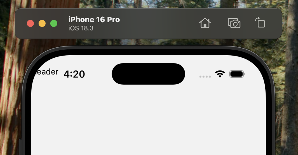
아이폰X이후로 상단 노치와 하단 인디케이터 부분이 생겨서 유의해야된다.
아무것도 없이 헤더를 그냥 작성하면 상단바 처음부터 작성됨.SafeAreaView를 쓰면 안전한 영역에서부터 시작할 수 있다.
const Header = () => {
  return (
    <SafeAreaView style={styles.container}>
      <View>
        <Text>Header</Text>
      </View>
    </SafeAreaView>
  )
}
아이폰 UI를 그리는 데 도움을 줄 라이브러리
https://github.com/ptelad/react-native-iphone-x-helper
(현재 아카이빙됐고, react-native-safe-area-context로 대체)
react-native-iphone-x-helper 사용방법 알아보기
설치npm i react-native-iphone-x-helper --save
사용
import {
  getStatusBarHeight,
  getBottomSpace,
} from "react-native-iphone-x-helper";

const statusBarHeight = getStatusBarHeight(true);
const bottomSpace = getBottomSpace();

console.log(`${Platform.OS} statusBarHeight: ${statusBarHeight}`);
console.log(`${Platform.OS} bottomSpace: ${bottomSpace}`);

const styles = StyleSheet.create({
  container: {
    paddingTop: statusBarHeight,
    paddingBottom: bottomSpace,
  },
})
SafeAreaView를 사용하지 않고도
상단바 아래부터 컴포넌트를 그릴 수 있게됨
이런방식으로 View를 사용하고 상태바(상단바)에 패딩을 줄것이다.
bottom space는
탭바를 넣을때 또 bottom space를 바로 띄워버리면 공백이 생기므로 이건 탭바 컴포넌트에서 이용해볼것.
react-native-safe-area-context 사용방법
깃헙, document 링크
https://github.com/AppAndFlow/react-native-safe-area-context
https://appandflow.github.io/react-native-safe-area-context/
설치
npm install react-native-safe-area-context
yarn add react-native-safe-area-context
사용방법
useSafeAreaInsets 객체안에는 { top: number, right: number, bottom: number, left: number }이 포함돼있음
import { useSafeAreaInsets } from 'react-native-safe-area-context';

function HookComponent() {
  const insets = useSafeAreaInsets();

  return <View style={{ paddingBottom: Math.max(insets.bottom, 16) }} />;
}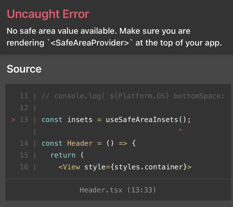
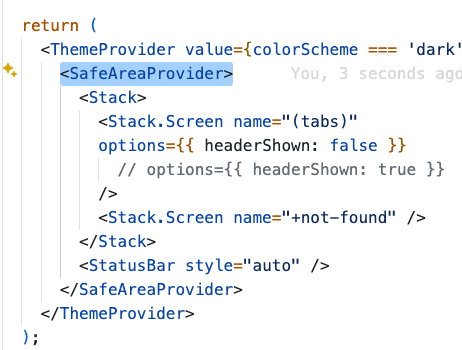
SafeAreaProvider로 한번 감싸줘야된다고함.
_layout.tsx에서 ThemeProvider 아래에 넣어줬다.
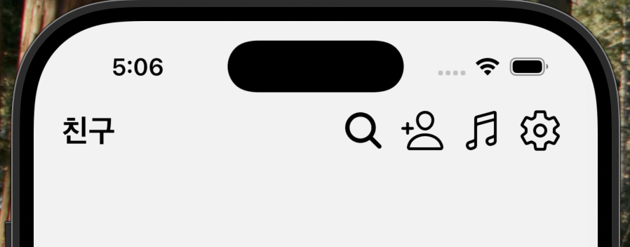
const Header = () => {
  // safe area insets
  const insets = useSafeAreaInsets();
  return (
    <View style={[{ paddingTop: insets.top }, styles.headerContainer]}>
      <Text style={styles.title}>친구</Text>
    </View>
  );
}
그리고 컴포넌트 내부에서 useSafeAreaInsets()를 호출!
하고 style속성에서 배열[]로 styles와 올바르게 병합한다.
아이콘버튼 컴포넌트
https://docs.expo.dev/guides/icons/
기본으로 포함돼있는 아이콘 사용할거임 설치 안필요함
여기서 사용할 아이콘 검색가능
interface IconButtonProps {
  // name: string;
  name: keyof typeof Ionicons.glyphMap;
}
const IconButton = (props: IconButtonProps) => {
  return (
    <View style={styles.buttonItem}>
      <Ionicons name={props.name} size={32} color="#000" />
    </View>
  );
};
const Header = () => {
  // safe area insets
  const insets = useSafeAreaInsets();
  return (
    <View style={[{ paddingTop: insets.top }, styles.headerContainer]}>
      <Text style={styles.title}>친구</Text>

      <View style={styles.buttonArea}>
        <IconButton
          name="search"
        />
        <IconButton
          name="person-add-outline"
        />
        <IconButton
          name="musical-notes-outline"
        />
        <IconButton
          name="settings-outline"
        />
      </View>
    </View>
  );
}
const styles = StyleSheet.create({
  headerContainer: {
    flexDirection: "row",
    justifyContent: "space-between",
    alignItems: "center",
    width: "100%",
    paddingVertical: 10,
    paddingHorizontal: 20,
  },
  title: {
    fontSize: 22,
    fontWeight: "bold",
  },
  buttonArea: {
    flexDirection: "row",
    justifyContent: "space-between",
  },
  buttonItem: {
    paddingHorizontal: 5,
  }
});'Frontend > React Native' 카테고리의 다른 글
| React Native 2-1. 카카오톡 친구목록 클론코딩(3): expo 기본앱에서 tabbar 커스텀 하기 (0) | 2025.03.13 |
|---|---|
| React Native 2-1. 카카오톡 친구목록 클론코딩(2) (0) | 2025.03.10 |
| React Native Expo실행시 iOS Simulator 실행안됨 해결 (0) | 2025.03.06 |
| React Native 1-2. 코어컴포넌트, prop, React Hooks (0) | 2025.03.06 |
| React Native 1. 소개 및 Expo 세팅 (0) | 2025.02.19 |


